Looking to convert more clients through your digital marketing? Have you checked your website traffic yet? Which % of website visitors become your clients?
If the answer is “not enough”, you might need a high-converting landing page.
Your landing page must be designed according to your audience and consistent with your business goals. Before jumping into the depths, let’s understand what a landing page is.
What is a landing page?
A landing page is where a visitor “lands” after clicking on a link from an email or ads from a website or social media.
Landing pages are different from home pages, which are designed for exploration. The goal of landing pages is to convert visitors to a specific campaign. In short, landing pages are designed for conversion.
Your landing page needs to be designed specifically for one campaign, either to target a specific audience or promote a specific offer. Looking to design a website with landing pages? Check out our portfolio to get some ideas.
Features of a successful landing page
What makes a landing page high-converting? In this blog, we will talk about elements that affect the user experience and conversion rate.
1) An eye-catching and relevant headline
First things first! The first thing people read on a landing page is a headline.
According to Copyblogger, “On average, 8 out of 10 people will read headline copy, but only 2 out of 10 will read the rest.”
That said, if your headline fails to grab attention, users won’t go through your landing page.
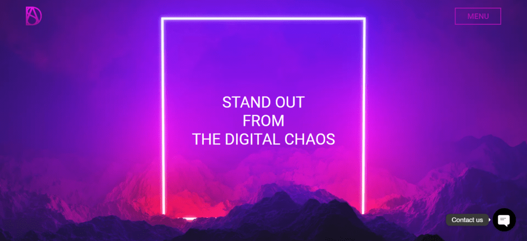
Your headline should address users’ pain points and uniquely showcase your offering. For instance, our website’s headline is “STAND OUT FROM THE DIGITAL CHAOS” (screenshot below). In the digital era, businesses want to make showcasing themselves distinctive. That’s what we offer in our website design and SEO service.
2) Visual hierarchy of content
Visual hierarchy impacts the conversion rate and affects how users perceive information. With that in mind, landing page design is a lot about visual hierarchy.
The visual hierarchy varies according to each landing page’s primary objective. For instance, if your objective is newsletter sign-up, you need to focus on providing useful information on the landing page. And if your objective is lead generation, you need to highlight the benefits of your products, visual content, and CTA. Learn more about lead generation with website.
Pro Tip
Don’t forget to optimise your landing page for different devices, as the visual hierarchy also varies according to devices.
3) Clarity of your value proposition
A study by Lindgaard, Fernandes, Dudeck, and Brown in the Taylor & Francis Online Journal found that users form an opinion about your site in 0.05 seconds. To make a good first impression, show the benefits of your services or products, not the features.
This way, users can quickly understand what you offer and are more likely to follow your call to action. Ensure the information flows mindfully and avoid repeating content to keep users engaged.
But while being concise is good, being too brief can undermine trust and credibility. You need to strike a balance by providing enough detail to inform and reassure users without overwhelming them.
A well-crafted landing page that combines clarity with detail can build trust and guide users to your desired outcome. Balancing detail and simplicity is key to a good user experience and achieving your goals.
4) Visual and interactive content
Images, videos, infographics, GIFs, and animation are all visual content. It helps users understand the landing page effortlessly. Irrespective of your landing page, it is always advisable to have some visual content.
A Few things to keep in mind:
- Make sure your images, videos, and GIFs are unique.
- It should be relevant to your landing page.
- It must be interesting to your users and easy to share.
- Interactive content improves landing page performance and brand impressions. Animation is the best example of interactive content.
5) An effective call-to-action that generates an uninterrupted flow of leads
A call-to-action is a sentence on a website that tells the user to take action. It’s one of the most important parts of a landing page. It should be aligned with your brand identity. Depending on your objective, there are many types of call-to-actions.
For instance, if your landing page is to promote emergency plumbing services, your call-to-action should be in the form of a very visible “call now” button.
For most of the landing pages, it should be in the above-the-fold area. It is also better to have a scrolling call-to-action or contact us form.
6) Customer Reviews
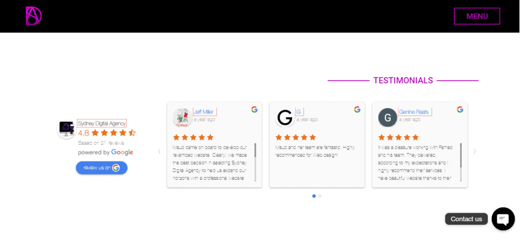
Customer reviews are social proof that showcases your industry expertise. Good feedback from existing customers gives users a positive sense of your brand. Without social proof, it is difficult to establish trustworthiness.
Video testimonials are the most credible thing you can put on your landing page. Although, if it is not available for you, you should have a carousel of customer reviews with ratings like those below.
In Conclusion
A landing page is necessary to convert your branding and marketing efforts for a specific campaign into clients. Designing a high-converting landing page will also require A/B testing and content updates.
If you need more clarification about the efficiency of your efforts, compare before and after implementing the above elements, then head over to Google Analytics. It gives comparison and behavioural analysis data for your website or landing page. Looking to create one for your brand? Contact our digital agency by sending an email to contact@syndeydigitalagency.com.au.
Related Posts

5 Tips for a Wicked Luxury Website Design
Irrespective of the product you are selling, there are a few things high-end luxury brands must follow to deliver a seamless experience. Everything from the

Generate New Leads with a Website for Small Business [2024]
Small business leads are often generated through referrals and connections. Every small business owner finds it challenging to get new leads outside their connections. Without

DESIGN A COMPETITIVE WEBSITE FOR LEAD GENERATION
Your website is THE FACE OF YOUR BUSINESS, and therefore the centre of your digital lead generation campaign. Designing a competitive website for lead generation
